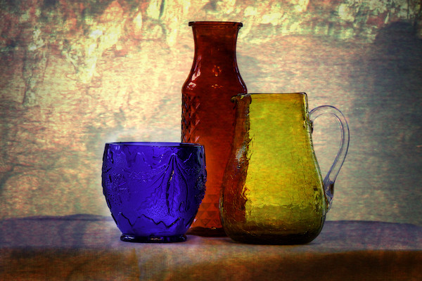
This looks like a painting. The muted colors of the well lit background really make the primary colors of the subject pop.
I wonder how it would look if the subject was a little off center to the right.
I will tell you a liabout this photo. I got a herniated disc at the end of February. Have been pretty much housebound since then – even without the virus. So one thing I have been doing is watching a lot of videos on processing.
I bought a bunch of colored glass for $25 at Goodwill in the beginning of winter. I was learning about textures. So one day I took this photo and appplied a bunch of different textures to it. It was amazing what the textures added in terms of mood. This was one of my favorites.
Immediately smiled when I saw this photo. The bright colors, interesting shapes and textured background are cheerful and comforting in this troubled time. Good job!
Love the colors and textures of this still life Barbara. I also like your composition—moving from the shorter blue glass to the tallest red bottle and then the “in between” yellow pitcher. As you know, I tend to like a square aspect ration-although I hope I’m not a zealot about it. For this image, you may wish to experiment with it because I am not sure what the amount of space on either site of the subjects adds and a square would reduce that space.
HI–sorry about the the injury– I really like the questioning–
is it a painting or is it a photo? When the viewer stops to look twice, that is an eye-catcher.
I love the way the objects overlap, and the colors. I also really like the textured background. It’s a wonderful still-life. The blue cup and red vase seem to be tilting a hair to the right. I’m curious how it was lit. Just sunlight coming in from the left side?
Barb, I love your choice of colors and the composition works very well. The different textures of the bottles add depth and dimension to this image. I applaud your spirit of experimentation and hope you are up and around soon.
This looks like a painting. The muted colors of the well lit background really make the primary colors of the subject pop.
I wonder how it would look if the subject was a little off center to the right.
I will tell you a liabout this photo. I got a herniated disc at the end of February. Have been pretty much housebound since then – even without the virus. So one thing I have been doing is watching a lot of videos on processing.
I bought a bunch of colored glass for $25 at Goodwill in the beginning of winter. I was learning about textures. So one day I took this photo and appplied a bunch of different textures to it. It was amazing what the textures added in terms of mood. This was one of my favorites.
nice work!
Immediately smiled when I saw this photo. The bright colors, interesting shapes and textured background are cheerful and comforting in this troubled time. Good job!
Very effective use of texture. It gives at
Real painterly effect. Nice choice of glasses and set up as well.
Love the colors and textures of this still life Barbara. I also like your composition—moving from the shorter blue glass to the tallest red bottle and then the “in between” yellow pitcher. As you know, I tend to like a square aspect ration-although I hope I’m not a zealot about it. For this image, you may wish to experiment with it because I am not sure what the amount of space on either site of the subjects adds and a square would reduce that space.
HI–sorry about the the injury– I really like the questioning–
is it a painting or is it a photo? When the viewer stops to look twice, that is an eye-catcher.
I love the way the objects overlap, and the colors. I also really like the textured background. It’s a wonderful still-life. The blue cup and red vase seem to be tilting a hair to the right. I’m curious how it was lit. Just sunlight coming in from the left side?
Hope your back gets better!
I agree with all the nice comments above. Color, lighting, and composition are all just right. I love the colors.
thank you all for your kind comments. I hope you are all well and that we can meet in person soon.
Barb, I love your choice of colors and the composition works very well. The different textures of the bottles add depth and dimension to this image. I applaud your spirit of experimentation and hope you are up and around soon.
Beautiful image. Everything works together to make it look like and impressionist painting.