I love the way I am drawn into this by the color tone of the buildings and the sky, the lines that my eyes can’t help but follow, the vehicle in the center that is close to where the street ends, draws attention to it continuing on. I like all the little details of colors that pop against the earth tone buildings. reflections in the building windows, flags, street lights…love this.
There is a lot here and it all works together—the light, the warm tones, the reflections in the window, the leading red car, the geometry of the crosswalk lines and the converging space of the buildings drawing us in. Well done.
I just love this image. The yellow light makes it very relaxing and the soft focus makes it look almost like and impressionist painting. My only minor suggestion is to work on the one part of one cloud that is blown out.
If it weren’t for the car models, I’d think this was from the ‘40’s or ‘50’s! Very nostalgic of simpler times (or current ones, sadly), and I love the palette.
Beautiful image with gorgeous, rich colors. The red card, the jewel tone reflections in the window on the left, the bright sunlight on the buildings, all pull the eye further and further down the street. I also like how you included the white lines and crosswalk markings. They echo the structure of the buildings.
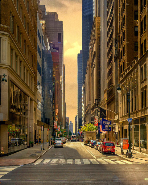
Mellow yellow gotta love it.
I especially like the fact that there are no details hidden in shadows.
I love the way I am drawn into this by the color tone of the buildings and the sky, the lines that my eyes can’t help but follow, the vehicle in the center that is close to where the street ends, draws attention to it continuing on. I like all the little details of colors that pop against the earth tone buildings. reflections in the building windows, flags, street lights…love this.
There is a lot here and it all works together—the light, the warm tones, the reflections in the window, the leading red car, the geometry of the crosswalk lines and the converging space of the buildings drawing us in. Well done.
I just love this image. The yellow light makes it very relaxing and the soft focus makes it look almost like and impressionist painting. My only minor suggestion is to work on the one part of one cloud that is blown out.
The other comments are all my thoughts as well. It reminds me of a hand tinted postcard. Love it.
It feels like an image from another time. I love the leading lines and muted tones.
If it weren’t for the car models, I’d think this was from the ‘40’s or ‘50’s! Very nostalgic of simpler times (or current ones, sadly), and I love the palette.
I like the image, but I am not crazy about the color saturation. Apparently, others like it, though.
The colors were not saturated. It’s straight out of the camera. I actually didn’t even tint it. Just a lucky time of day super early in the morning.
Beautiful image with gorgeous, rich colors. The red card, the jewel tone reflections in the window on the left, the bright sunlight on the buildings, all pull the eye further and further down the street. I also like how you included the white lines and crosswalk markings. They echo the structure of the buildings.