The light foreground fading in to the dark enhances the tunnel effect. I love the way you brought out the mottling of the top of the tunnel, it almost looks like clouds overhead.
Good composition. I like the choice of not shooting head on. The tilt of the floor, the curve toward the depth of the tunnel, which is only half shown gives me the impression as a viewer of careening around in a dream.
I love this! A marvelous abstract that reveals much detail upon further inspection. The colors and designs are wonderful. I would suggest removing the green line from the right, but not cropping, since you’d lose the white trim on the black shape. Also, since the diagonal line is almost in the center, vertically, I’d suggest cropping a little from the top to place the line exactly at center and enhance the graphic quality.
I studied this for a while–what kind of tunnel is it? Why do the bricks in the foreground pitch downward so steeply? Why do people feel compelled to leave their mark, no matter how inconspicuous the location?
The reds and blacks of the bricks are very dramatic and lend an air of menace. Nice work!
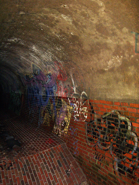
The colors are lovely, the multidirectional bricks made me look. Cool pic.
The light foreground fading in to the dark enhances the tunnel effect. I love the way you brought out the mottling of the top of the tunnel, it almost looks like clouds overhead.
I really like this photo–I echo above. I just suggest cropping a little on the right and top–
Good composition. I like the choice of not shooting head on. The tilt of the floor, the curve toward the depth of the tunnel, which is only half shown gives me the impression as a viewer of careening around in a dream.
I like the point of view in this photo which leads me up and into this rather scary dark tunnel.
I agree with everything said above. But, I keep wanting to look further down the tunnel. Perhaps a crop showing more of the tunnel to left?
I love this! A marvelous abstract that reveals much detail upon further inspection. The colors and designs are wonderful. I would suggest removing the green line from the right, but not cropping, since you’d lose the white trim on the black shape. Also, since the diagonal line is almost in the center, vertically, I’d suggest cropping a little from the top to place the line exactly at center and enhance the graphic quality.
I studied this for a while–what kind of tunnel is it? Why do the bricks in the foreground pitch downward so steeply? Why do people feel compelled to leave their mark, no matter how inconspicuous the location?
The reds and blacks of the bricks are very dramatic and lend an air of menace. Nice work!