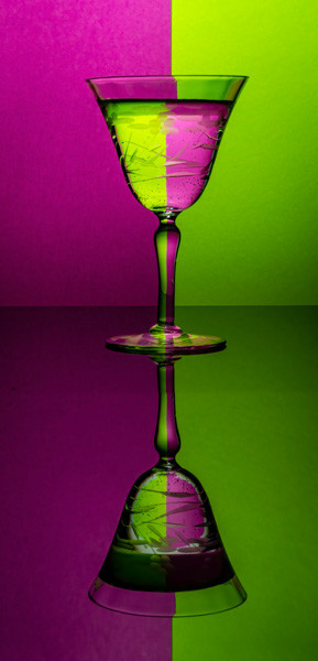
The more I look at this, the more I like it. The colors are really dramatic, and it’s a nice balance of light and dark.
But what really grabs me is the composition. At first glance, it looks almost perfectly symmetrical, but it isn’t really. The base of the glass is not half way. The space above the top glass and the space below the bottom half are not equal. But it reads so perfectly balanced. The less obvious elements in the composition pull it all together: the dark band in the lower glass balances (to my eye), the brightness of the green in the upper glass. The band of shadow across the center makes it feel as though the image is exactly divided horizontally.
There are many little tricks it plays on my as I look at it. Nice.
This is a pleasant surprise! Great lighting, and the color is so vibrant.
Not to mention that green and purple have been associated with poison for centuries. Looks tempting, but no thank you!
Excellent image, well done.
A classic refraction picture. Nicely done.
The more I look at this, the more I like it. The colors are really dramatic, and it’s a nice balance of light and dark.
But what really grabs me is the composition. At first glance, it looks almost perfectly symmetrical, but it isn’t really. The base of the glass is not half way. The space above the top glass and the space below the bottom half are not equal. But it reads so perfectly balanced. The less obvious elements in the composition pull it all together: the dark band in the lower glass balances (to my eye), the brightness of the green in the upper glass. The band of shadow across the center makes it feel as though the image is exactly divided horizontally.
There are many little tricks it plays on my as I look at it. Nice.
Spectacular!!
Aren’t these fun. I’ve done a few myself for our assignment. I really like your use of the mirror.
This is a pleasant surprise! Great lighting, and the color is so vibrant.
Not to mention that green and purple have been associated with poison for centuries. Looks tempting, but no thank you!
Kathy Marotta’s comments really say it all.
I am flummoxed. Can’t figure out how you composed this. Love it.
Love the colors, vibrant. Great composition