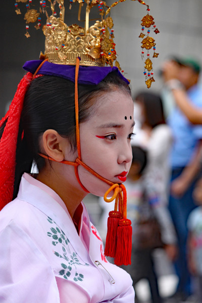
I’m not sure what to do at the top of the frame. It seems to me that the headpiece is cut off at an awkward spot. Not knowing what was there, I think that including a bit more at the top of the frame would be better.
Either that or crop down some more and clone out the piece that would then be floating in the air unattached.
Whoa, wait a minute, I don’t think this needs a fix. I like that the focus is on the child’s face. Any more of the headpiece would distract from her expression. The piece hanging down is enough to suggest the elaborate crown without distracting from the subject. (of course this is just my opinion.)
Love the face, the costume, painting and color. I think the crop is a judgment call. If I was to change anything, it would be the background. It is already deemphasized with the depth of field, but I still feel that it distracts from the subject. I’d think about either a radial filter or vignetting to make the background darker.
Nice!
I’m not sure what to do at the top of the frame. It seems to me that the headpiece is cut off at an awkward spot. Not knowing what was there, I think that including a bit more at the top of the frame would be better.
Either that or crop down some more and clone out the piece that would then be floating in the air unattached.
Thank you for the nice critique.
I will try to fix it.
Whoa, wait a minute, I don’t think this needs a fix. I like that the focus is on the child’s face. Any more of the headpiece would distract from her expression. The piece hanging down is enough to suggest the elaborate crown without distracting from the subject. (of course this is just my opinion.)
Also great depth of field.
Torn between Frank’s and Kathy’s input. At first I wanted more of the headdress, but the focus is on the face.
Love the face, the costume, painting and color. I think the crop is a judgment call. If I was to change anything, it would be the background. It is already deemphasized with the depth of field, but I still feel that it distracts from the subject. I’d think about either a radial filter or vignetting to make the background darker.
Lots to look at and lovely details and color. I agree with Larry about the background.
Beautiful subject. Nicely done.