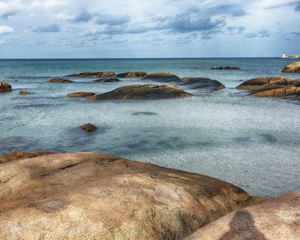
I like the flow and lighting of this photo, but I see your shadow in the foreground. Run the spot healing tool in photoshop over that to perfect your image.
Nice tones. I’m thinking longish exposure? I’m wondering if there was a little more to the scene to the right of the lighthouse, in which case maybe panning a tad in the direction, which would have cut out the rock on the left edge, which at least to me is a bit distracting. I have mixed feelings about your shadow. Did you leave it in intentionally?
Yes,there is more of the scene to right, but unfortunately it is a big building that detracts from the lighthouse. I did a pano of this and would have posted that, but the size restrictions made the image pixelate.
The dark spot looks like my shadow, but in fact is weathering of the rock. When enlarged to 200% the weathering is more obvious, but you can see gradations in color that would not be present in a shadow. It was intentionally left in and begs the question “Because it can be changed should it?”.
I see that now. Thanks for the clarity.
“Because it can be changed should it?” Sometimes yes, sometimes no. If I can’t avoid getting my shadow in a shot I usually do.
It would be okay with me even if it were a shadow–but it becomes even more interesting when I learn it’s the rock itself.
The clouds are important. They help to round out the composition and they (sort of) mirror the rocks in the water. I like it.
So serene. Love the colors and the exposure. I didn’t see the lighthouse immediately… it adds an element of interest and perspective. I thought that the shading on the right was a shadow but I like that you included both of the rocks in the foreground…like the softness of the edges that it shows.
If this were my image, I would crop out the lighthouse and I would apply a small amount of cloning (or healing) brush to the “shadow”… just enough to distort the shape so that it does not look so much like a human form,
The lighthouse is, to my mind, just a distraction from an otherwise interesting seascape. The contrast between the warm and cool tones is wonderful, as is the texture of the water.
The “shadow” is distraction only because it looks like a human… any other shape would be fine.
The use of a higher ISO seems to have captured a beautiful, softer quality on the colors of every object throughout the frame. It all makes for a dreamy, relaxing look. Well done.