I like that this is shot straight-on, so that the perspective is achieved by the rectangles within rectangles.
This is the kind of photo you could crop in a lot of different ways. I’d like to see it with the rock and the other blobby object at the bottom cropped out. They distract me from the interesting composition created from straight lines and planes.
I like the face, don’t crop it out! I wish I could see some detail in that black thing, what is it? I love the use of all zone tones. The building looks like it’s melting. Possible to clone out the little wedge in the top left?
This feels like a timeless image. The combination of the structure and lines of this building, in the way you framed it, shouts ‘thirds’ in so many combinations that it’s like looking at multiple photographs. Fascinating. Well done.
If I were to crop this photo, I would crop down from the top to eliminate the roof.
I like the layers…outside, wall, inside, wall, outside. Complex and interesting.
Maybe experiment with the toning… old wood looks good with a slightly warm tone, not that the neutral tone is bad.
However, I am biased much of my work is printed with a an ink set characterized as “warm neutral”.
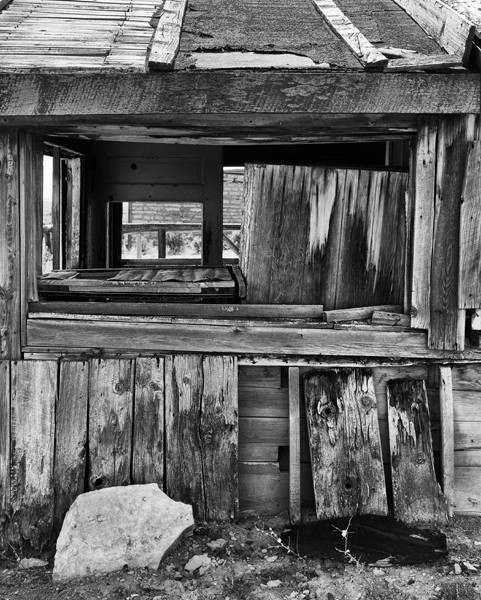
I see a face on the lower right board. I can’t unsee it now.
I like that this is shot straight-on, so that the perspective is achieved by the rectangles within rectangles.
This is the kind of photo you could crop in a lot of different ways. I’d like to see it with the rock and the other blobby object at the bottom cropped out. They distract me from the interesting composition created from straight lines and planes.
Thanks for the cropping suggestions. I’ll give them a try and they may take care of the distracting Edvard Munch face.
I like the face, don’t crop it out! I wish I could see some detail in that black thing, what is it? I love the use of all zone tones. The building looks like it’s melting. Possible to clone out the little wedge in the top left?
This feels like a timeless image. The combination of the structure and lines of this building, in the way you framed it, shouts ‘thirds’ in so many combinations that it’s like looking at multiple photographs. Fascinating. Well done.
If I were to crop this photo, I would crop down from the top to eliminate the roof.
I like the layers…outside, wall, inside, wall, outside. Complex and interesting.
Maybe experiment with the toning… old wood looks good with a slightly warm tone, not that the neutral tone is bad.
However, I am biased much of my work is printed with a an ink set characterized as “warm neutral”.
There’s a lot to explore here. Interesting lines, shapes, textures. I like the face!
I agree with Frank about cropping the roof–the photo is interesting, but too busy for me.